Logo Draft
Logo must have PC letters.
Fuse Tech into this logo.
High End, Modern, and Sleek.
More timeless than trendy.
Use blue in the branding.
Power and Airflow quickly became the focus due to how important airflow is to a higher end computer. A high end PC needs the power demanding parts sufficiently cooled down. Cooling and Airflow are a must.

Fan blade negative space with a stem so a P can be seen in the mark. More of a literal approach to the airflow concept but the C wasn't visible.
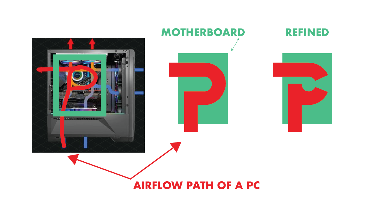
A Modern PC is structured in a way that provides maximum airflow around the power demanding parts that heat up That shape resembles a P.
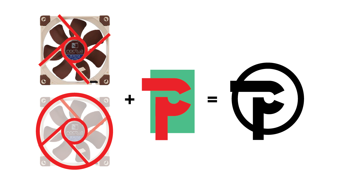
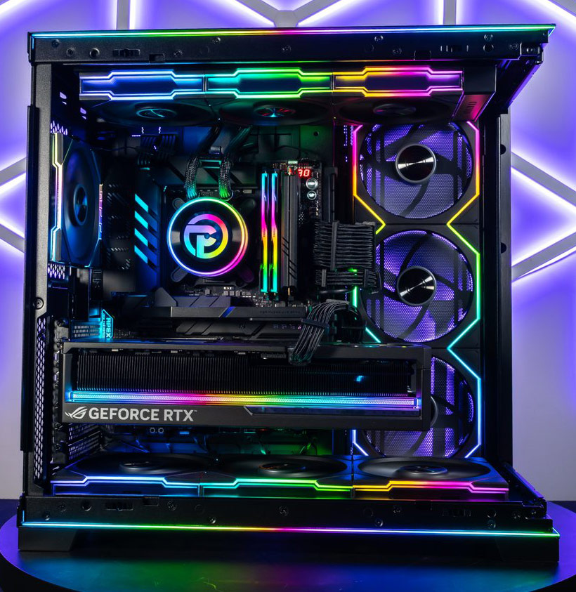
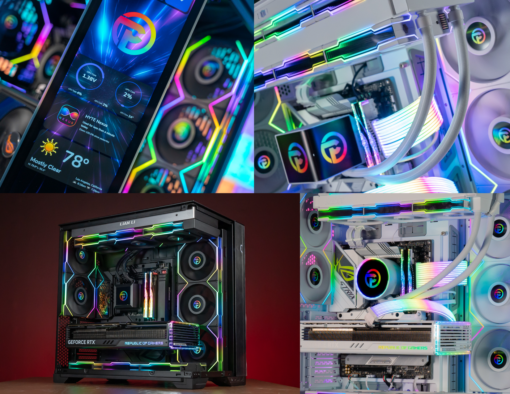
The Liquid Coolers used on the customers computers all had round monitors or a LED displays. Knowing a logo would be displayed in these places called for a circular mark. When revisiting the fan concept I came across certain fans that had support pillars. These pillars almost looked like a P rotated 90 Degrees. I merged the Motherboard P and the Fan Concept to achieve the final approved mark.





.jpeg)
.jpeg)